
Eyefinity Encompass Redesign
Objective
Identify and resolve critical workflow breakdowns in a high-volume optometric SaaS platform by improving visual hierarchy, preserving user context, and enabling in-place actions that reduce unnecessary navigation.
My Role
Research and design
Software
Figma, FigJam
Project Overview
Eyefinity Encompass is a multi-module healthcare SaaS platform used by MyEyeDr. to support clinical, administrative, and retail workflows across optometric practices. Following a company-wide transition from Acuity to Encompass, frontline staff experienced increased workflow friction, longer processing times, and reduced visibility into daily operations.
This project focuses on redesigning three core areas of the platform:
◉ the landing page dashboard
◉ the scheduling view
◉ and the appointment quick-view overlay.
The Problem
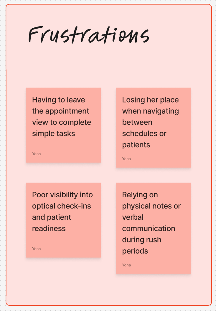
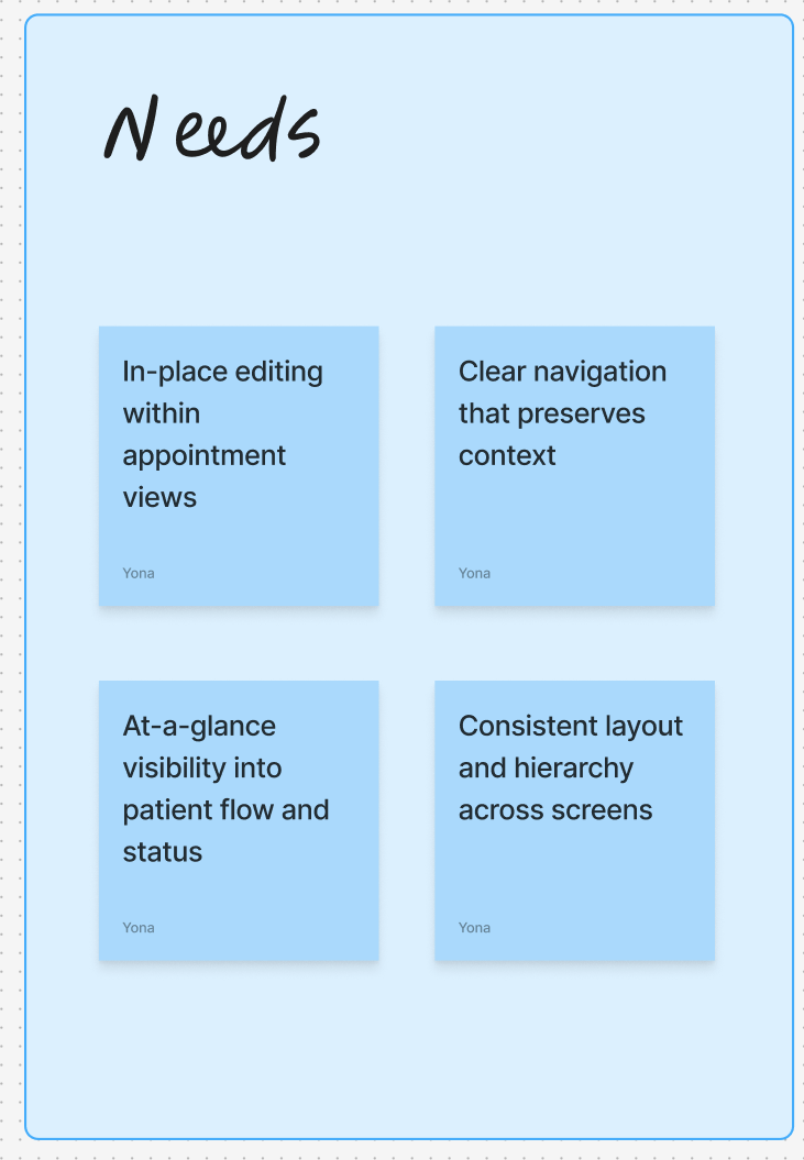
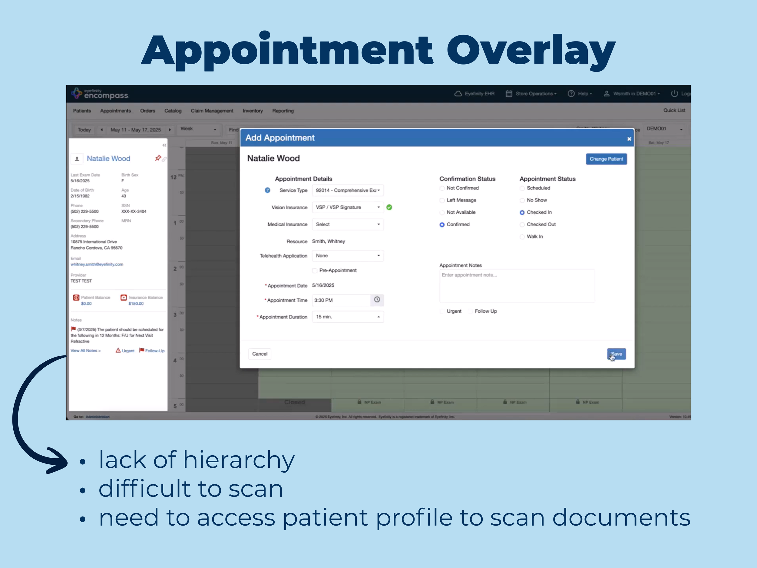
◉ Staff could not scan or upload documents during check-in without leaving the appointment flow
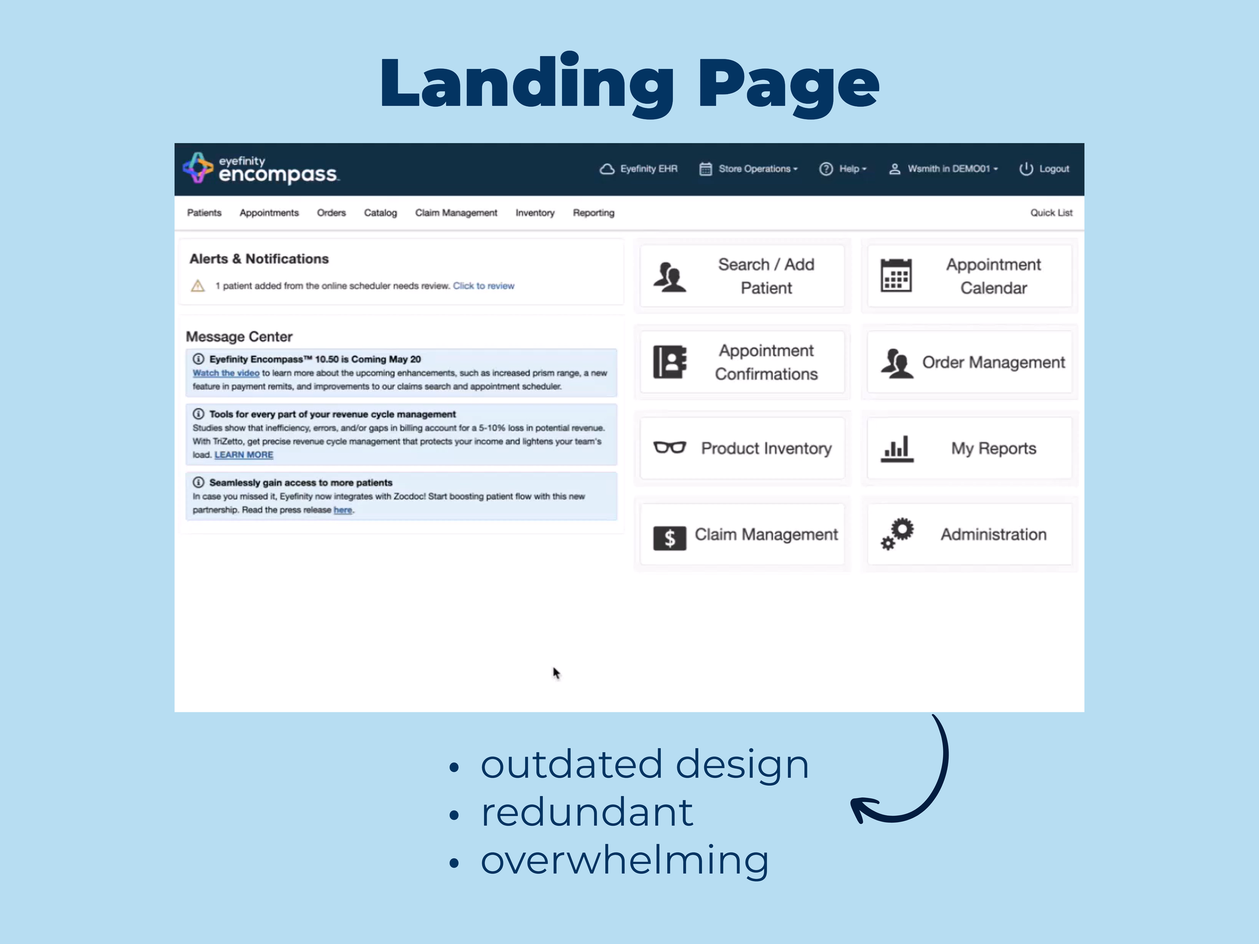
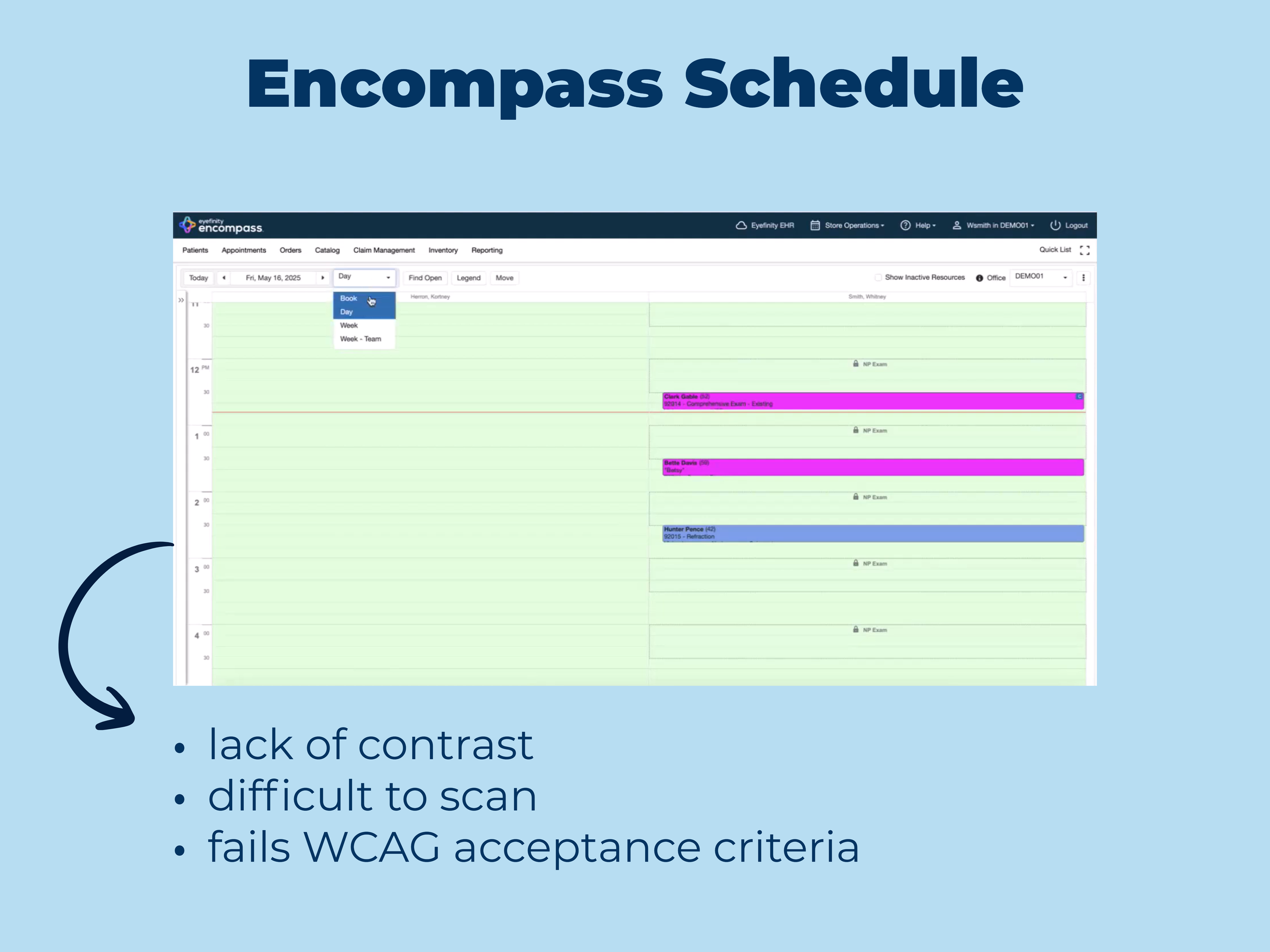
◉ Poor visual hierarchy made it difficult to distinguish sections and priorities
◉ Lack of internal messaging and visibility forced staff to rely on physical checklists and verbal communication

The Process
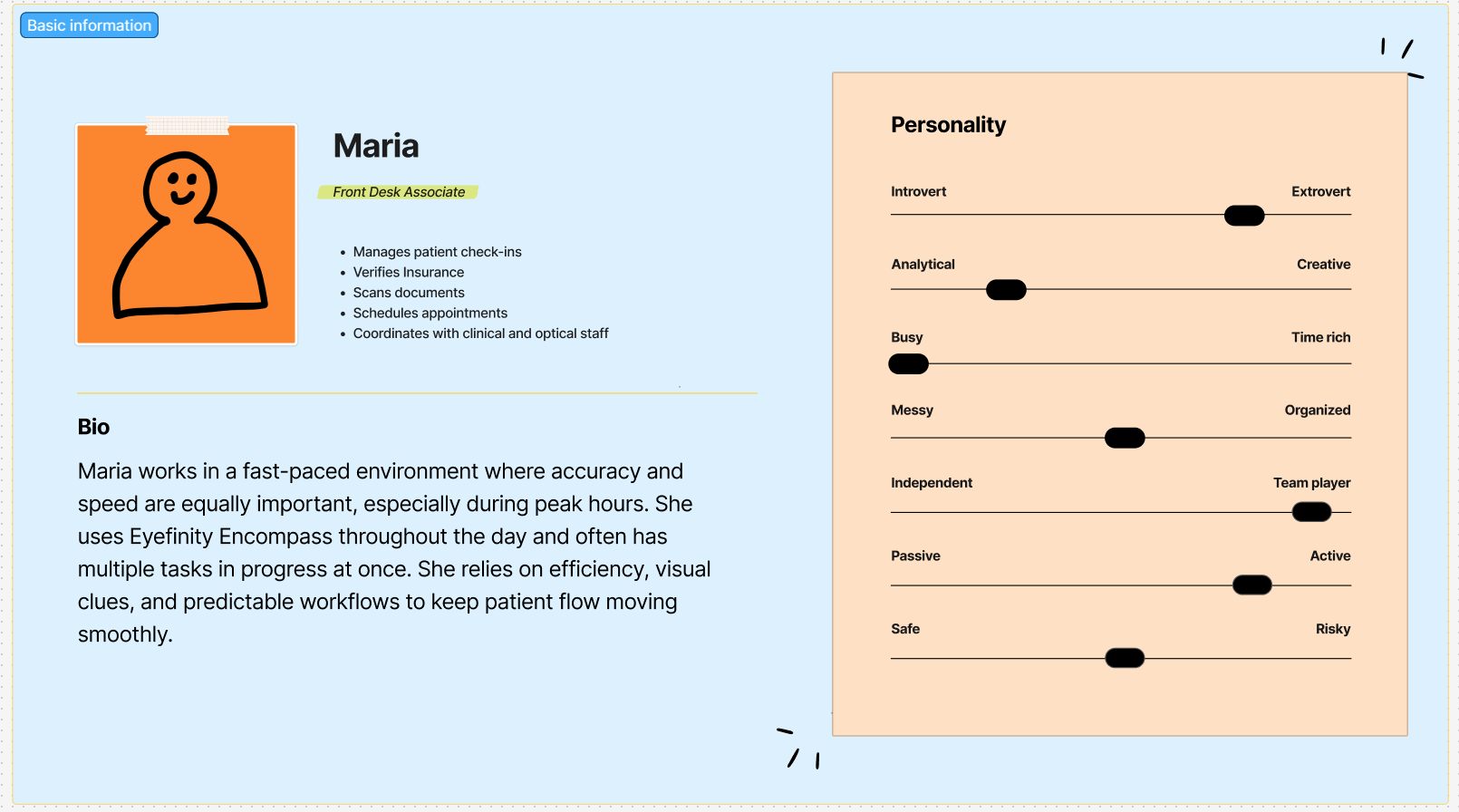
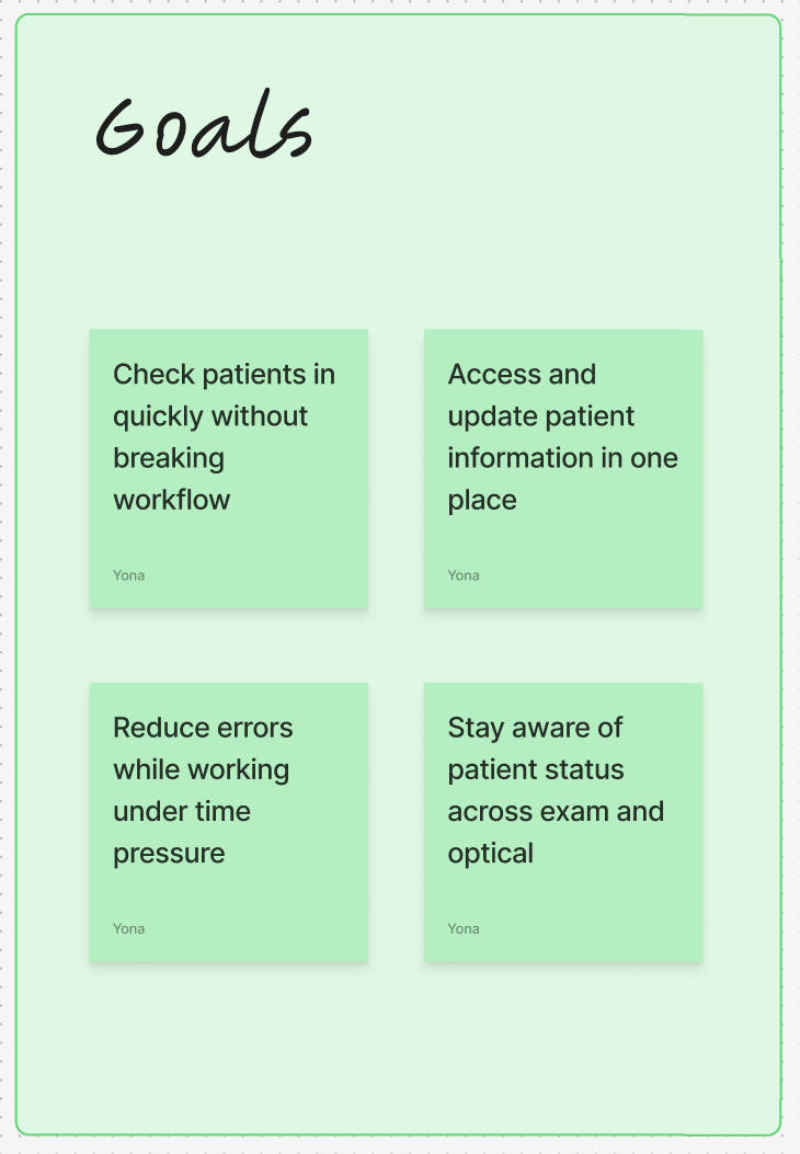
User persona
Journey Map
Key Issues
Creating the prototype
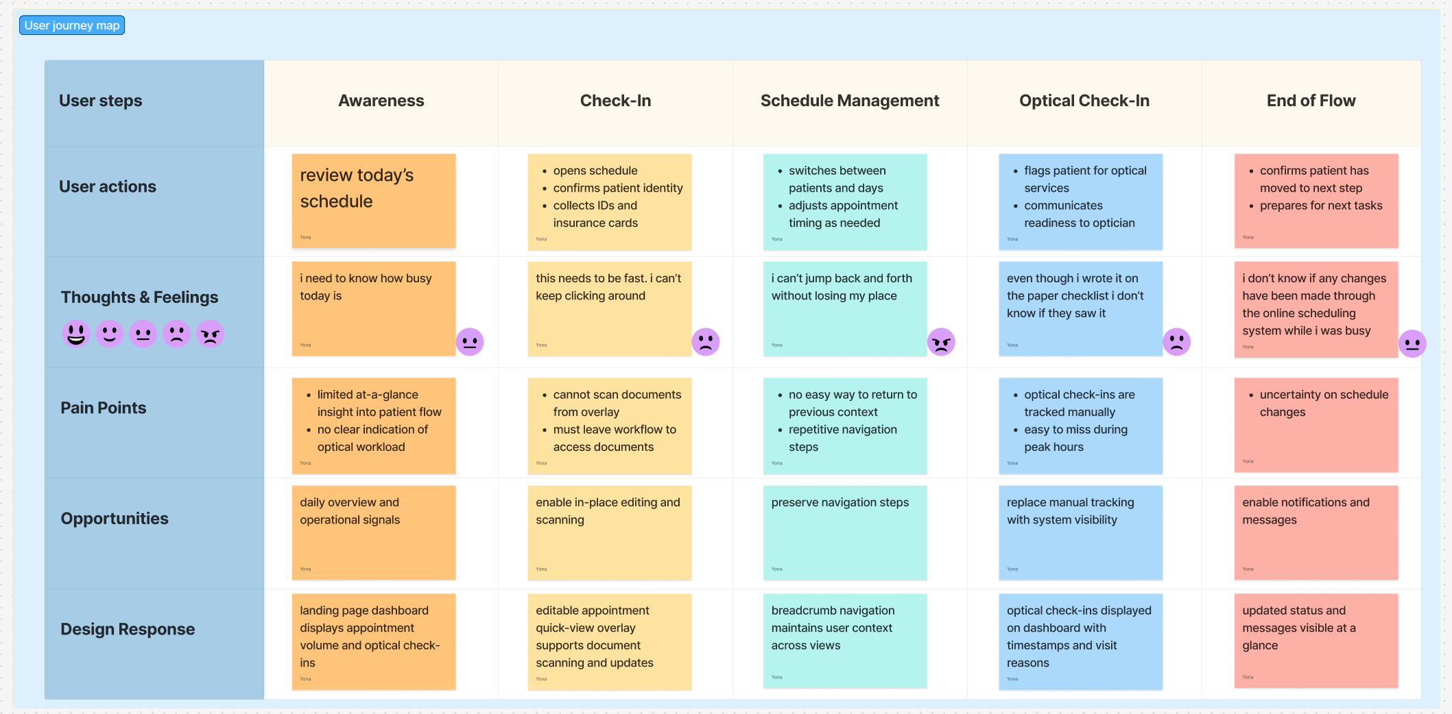
The prototype is directly shaped by insights from the user persona, journey mapping, and the identification of key workflow breakdowns. These artifacts helped prioritize high-frequency tasks and clarify where cognitive load and friction occurred throughout the day. Using this research, I designed modular components, such as the practice overview dashboard, that align with real staff mental models and daily workflows. Layouts are structured around clear hierarchy, predictable patterns, and scannability to support rapid comprehension in time-sensitive environments. Each design decision was validated against user needs uncovered during research, ensuring the prototype remained grounded in usability, accessibility, and efficiency.
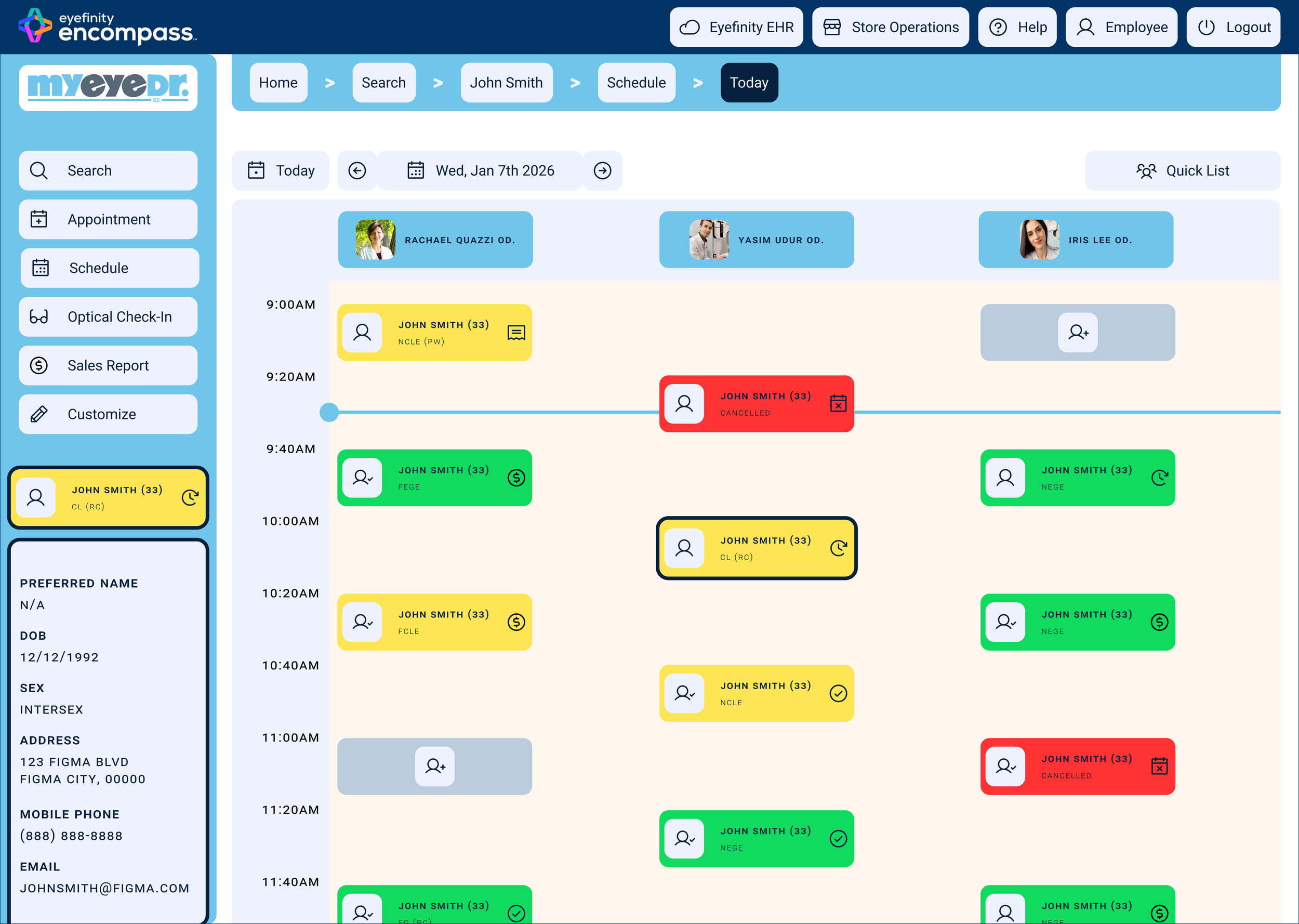
During research and journey mapping, a recurring issue emerged around navigation and loss of context when moving between schedules, patient profiles, and overlays. Staff frequently reported having to repeat steps to return to previous views, especially when working across different days or providers. To address this, breadcrumb navigation was introduced at the top of key views to provide clear wayfinding and preserve workflow context. Breadcrumbs allow users to understand where they are within the system and quickly navigate back without disrupting their task. This addition reduces cognitive load, minimizes unnecessary clicks, and supports faster task recovery in a high-volume clinical environment, ultimately improving efficiency for both individual users and the practice as a whole.

Visual Design and Branding
To ensure visual consistency and brand alignment, the redesign draws inspiration from the existing myeyedr.com website. Established brand colors, typography, and tone were adapted into the Encompass interface to create a cohesive experience between the public-facing site and the internal software used by staff. These elements were refined to meet the functional demands of an enterprise healthcare platform, with adjustments to contrast, spacing, and hierarchy to improve readability and accessibility. By grounding the visual theme in an already familiar brand system, the redesign reduces the learning curve for employees while reinforcing trust, professionalism, and clarity across the product ecosystem.


The Solution
Landing Page Dashboard
Before
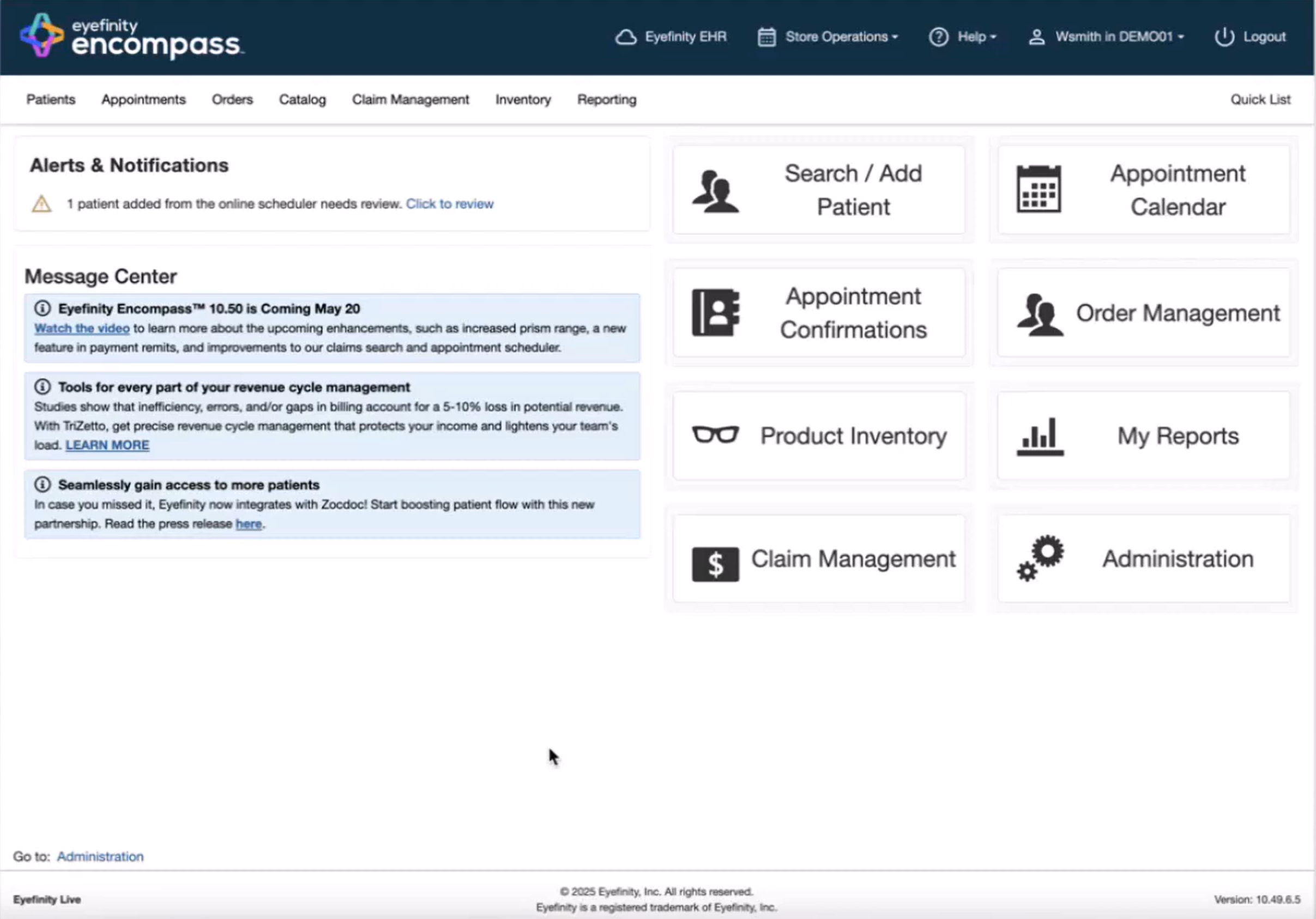
The original landing page prioritizes system-level navigation over daily staff needs. Key information is fragmented across multiple areas, requiring users to click into separate modules to understand patient flow, staffing, or operational status. Alerts and tools compete for attention, resulting in low visual hierarchy and limited scanability. As a result, staff lack an at-a-glance understanding of what needs immediate action.
After
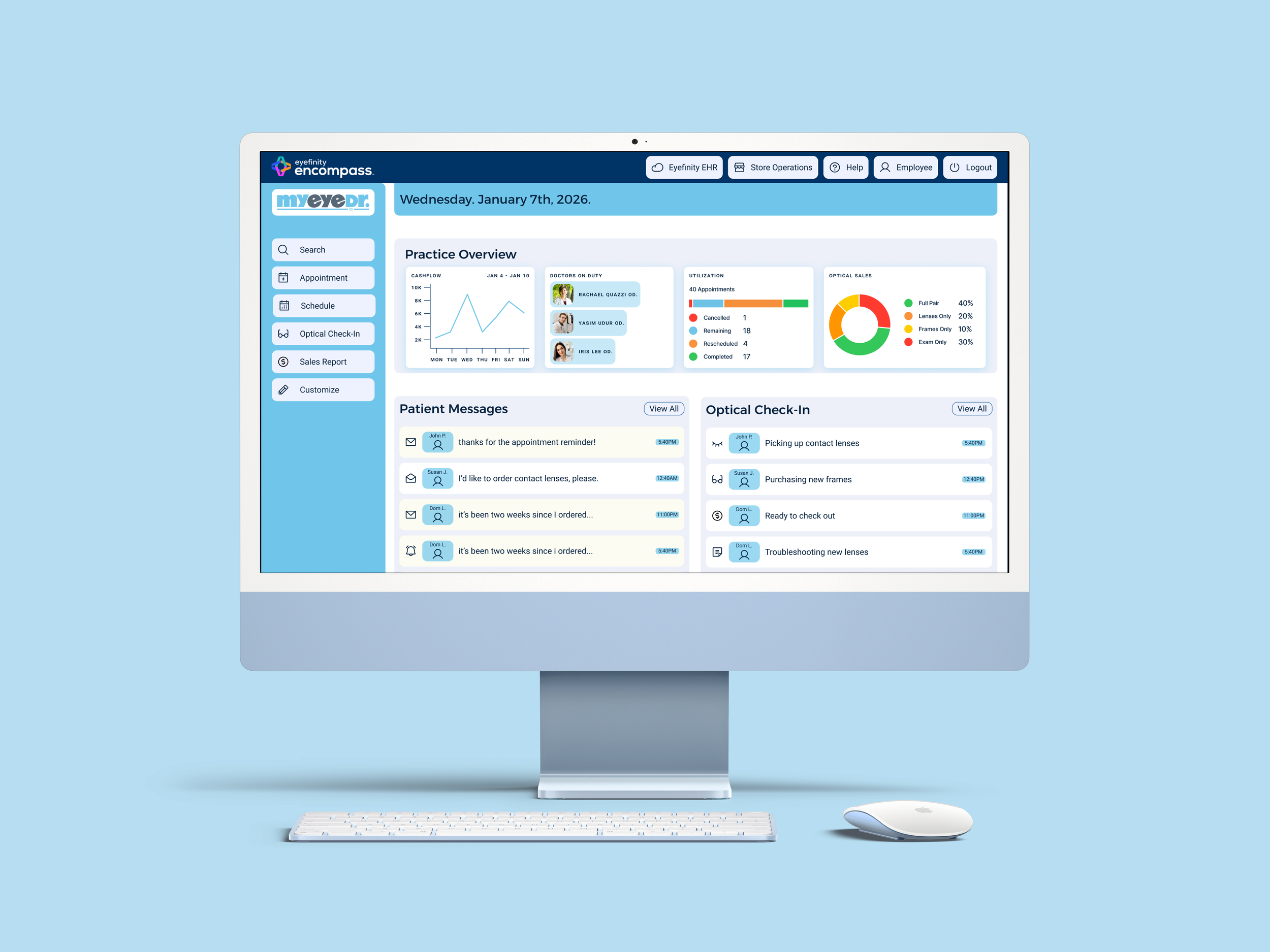
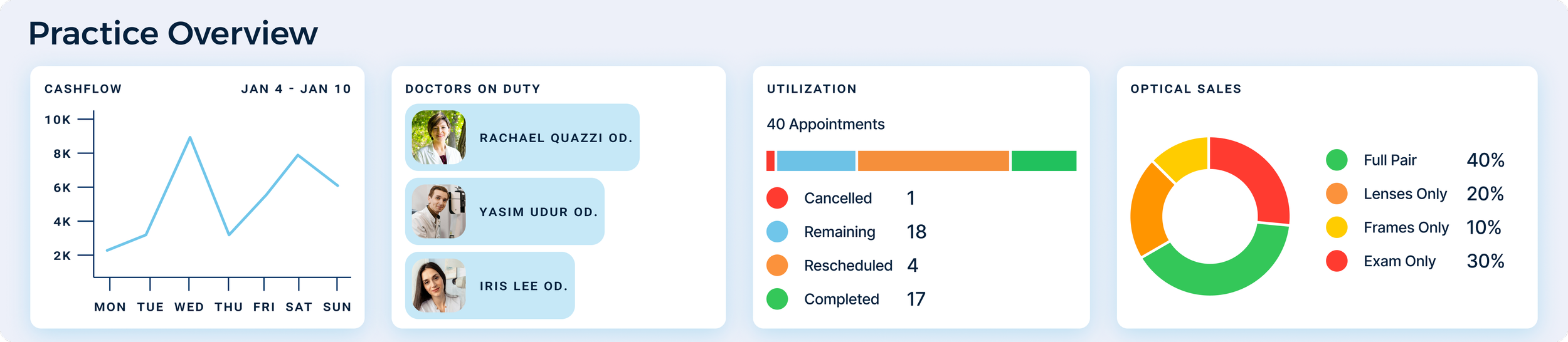
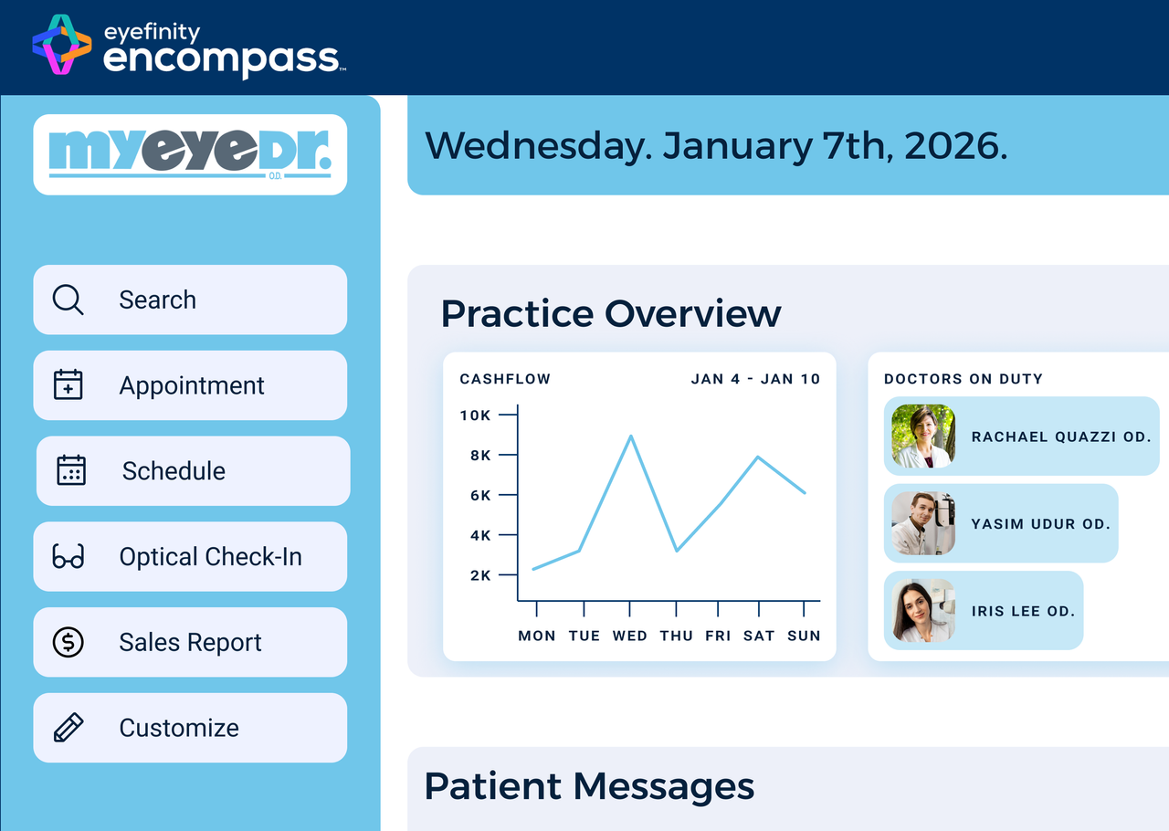
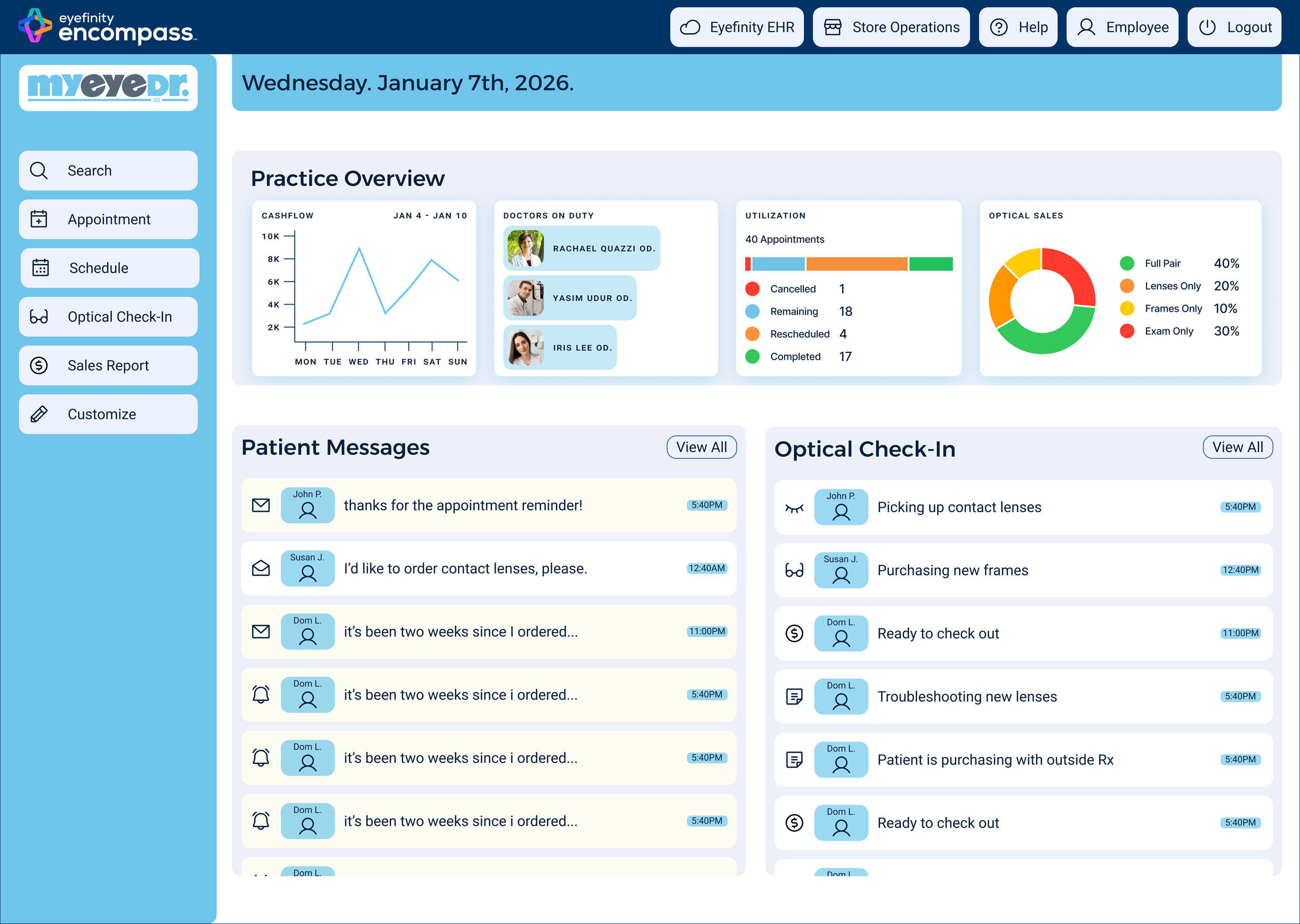
The redesigned dashboard surfaces high-priority information in a centralized practice overview. Components such as cashflow, doctors on duty, appointment utilization, patient messages, and optical check-ins are grouped logically and designed for quick scanning. Clear hierarchy, consistent card patterns, and visual indicators allow staff to assess the state of the practice within seconds, supporting faster decision-making and smoother daily operations.
Schedule View
Before
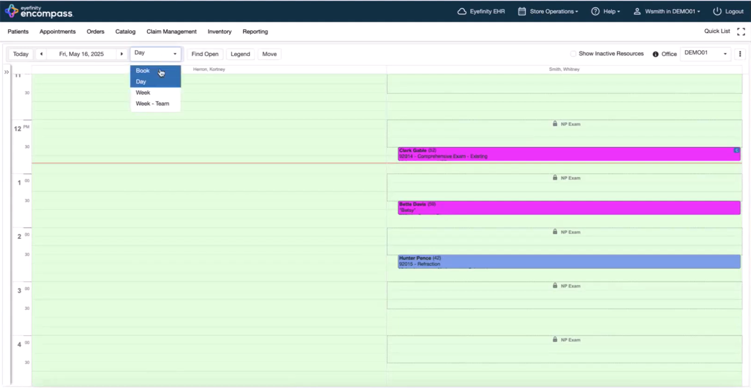
The existing schedule view relies heavily on dense layouts and low-contrast color usage, making it difficult to distinguish appointment types, statuses, and providers. Navigation between dates and views lacks context, forcing users to repeat steps when switching schedules. This increases cognitive load and slows down workflow, especially during high-volume periods.
After
The redesigned schedule introduces improved color contrast, clearer appointment states, and consistent iconography to support accessibility and rapid visual parsing. Breadcrumb navigation preserves context when moving between dates, providers, and patient records, reducing repetitive navigation. Together, these improvements allow staff to quickly understand schedule status, identify issues, and move confidently between tasks without losing their place.
Appointment Quick-View Overlay
Before
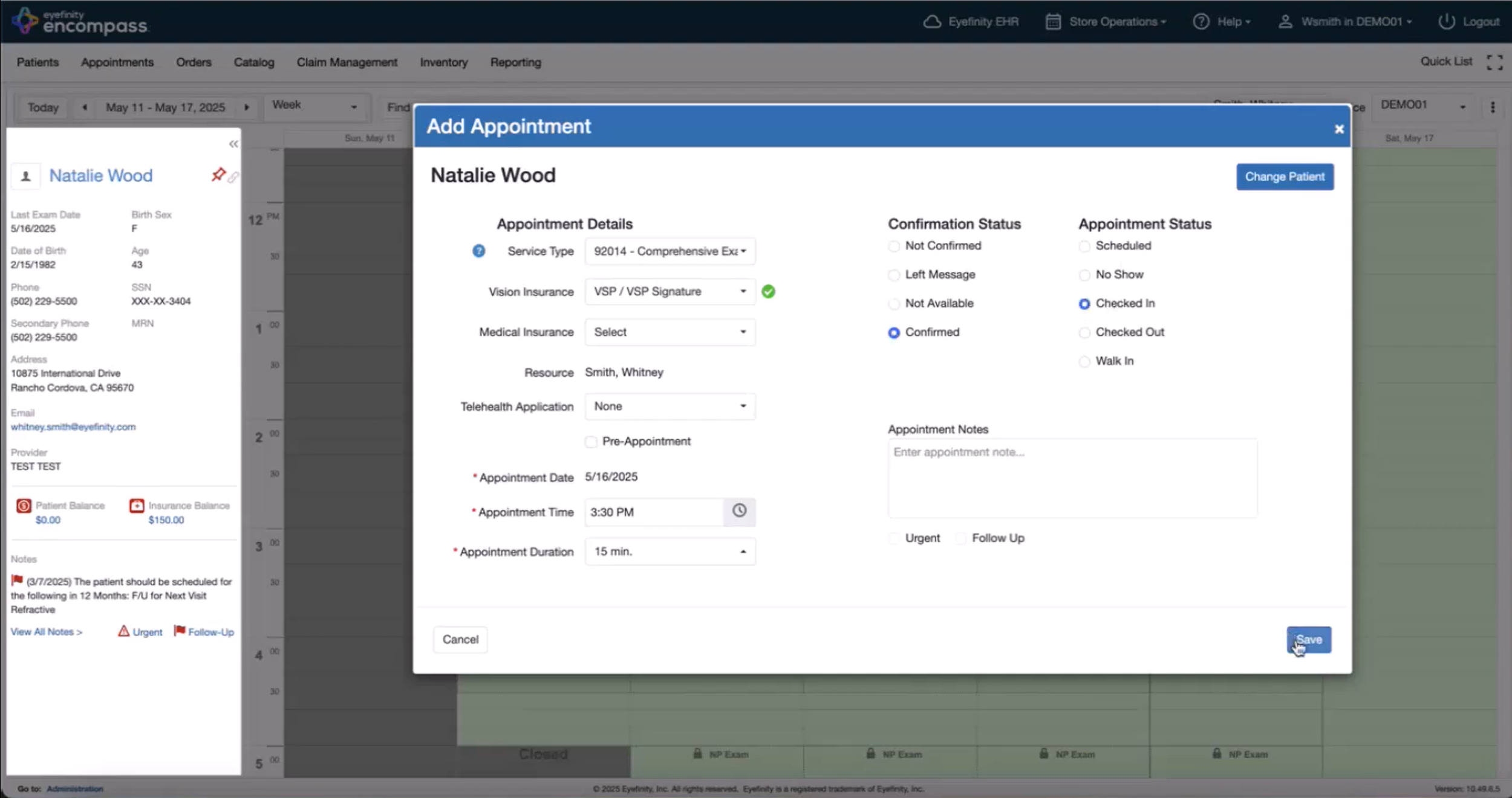
The original appointment overlay limits functionality, preventing staff from completing key tasks such as scanning documents during check-in. Users are forced to leave the schedule, navigate to the full patient profile, and locate document tools elsewhere in the system. This fragmented flow adds unnecessary steps and causes delays during high-traffic check-in periods.
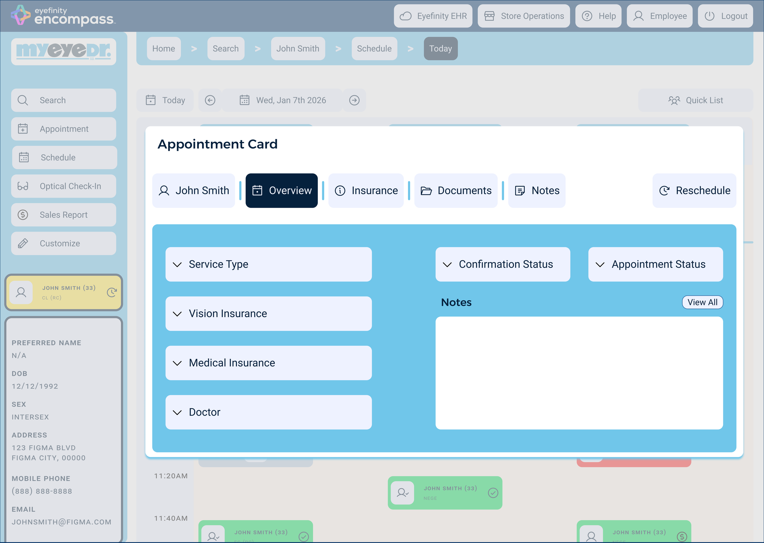
After
The redesigned quick-view overlay enables staff to complete essential actions directly within context. Features such as document scanning, insurance review, notes, and status updates are accessible without leaving the schedule. This reduces task switching, preserves workflow continuity, and supports faster, more efficient patient processing, particularly at the front desk.
What I learned 💭
What I learned 💭
This project emphasized the importance of designing within complex, real-world constraints. Working directly with Eyefinity Encompass in a high-volume optometric practice gave me first-hand insight into how fragmented workflows, context switching, and unclear hierarchy can significantly slow down operations. I learned that in enterprise healthcare software, efficiency is often shaped by small interaction decisions that either preserve or break user momentum throughout the day.
⋆✴︎˚。⋆
I also deepened my understanding of how visual hierarchy, accessibility, and scanability directly affect performance. Improving color contrast, standardizing component patterns, and introducing dashboards and contextual overlays helped reduce cognitive load and support faster decision-making. Breadcrumb navigation, in particular, highlighted how preserving navigation context can meaningfully reduce repetitive actions and frustration in multi-step workflows.
⋆✴︎˚。⋆
Finally, this project reinforced the value of balancing user-centered design with brand consistency and scalability. Aligning the redesign with myeyedr’s existing visual system ensured familiarity while allowing for targeted usability improvements. Overall, this experience strengthened my ability to translate research insights into pragmatic design solutions that support both user efficiency and broader business goals within a SaaS healthcare product.